Monday, 10 January 2011

Final Website Design


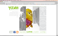
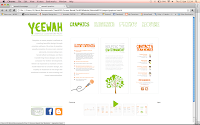
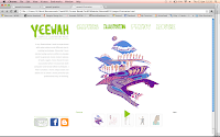
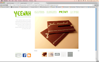
Overall I am very pleased with how my website turned out, even though there were a lot of ups and downs and I found it hard to get used to the new software of Dreamweaver because I’d never used before, I managed to get through this project successfully.

I found this brief the most enjoyable because I was able to create my own brand identity, which will be very useful for future portfolio/cv work. JQuery was very hard to figure out at first and coding was a completely new language to me. A lot of trial and error was needed so that I could familiarise myself with how Web Design worked. A lot of the time I felt very pressured for time and it was very stressful trying to figure out how hosting worked. Although after seeing how my website turned out I think it was all worth it.

Things to do after handing in to improve my website is to add metatags so that people can find my website. Add more work to my galleries, improve and personalise my contact form and update my profile picture from time to time.

In addition, I must check to see that my website works on cross browsers and test it out on other people’s computer and monitor screens to see the quality and make any amendments if needed. Also, my homepage still is a bit faulty sometimes because of the JQuery I used. I’m starting to think that there’s an error in the code I used so maybe when I have time I need to find another code that allows me to fade my images in and out when the cursor is hovered over it.

Monday, 13 December 2010

Tutorial


1) Homepage- image sizes (for smooth JQuery) when slices less than 250K

2) About Me- steer away from photographs, can maybe use drawing of self or a photo of me in my working environment

3) Overview of each topic replacing welcome intro- short description of why passionate about graphics/illustration/print intro rather than same text from homepage

4) Use live text rather than an image of text otherwise might not be legible and will take ages to load- use default fonts!

5) Think about point size for smaller monitor screens

6) Portfolio- if using slideshow, include play/pause button so viewer has choice of taking their time looking at work

7) Use title and description of work as captions

8) Tabs- grey box surrounding doesn’t fit with the style of the rest of the website

9) Cross browser- research how website might look on other browsers, test on Adobe Browser Labs

10) FTP- to upload all pages and image and css/Jquery

11) HTML contact form rather than including email address- efficient, professional and secure- design a ‘mail to’ button

12) Links- file names must have no spaces for these to work

Overall, website works well and represents me well. Good consistent styling of website and suitable choice of colours.

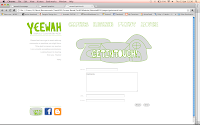
Get in Touch Button and Download CV Button:


Saturday, 11 December 2010

Further Development

Other things to think about:

1) First image of your work needs to be strong

2) Facebook like button?

3) Use of Galleria

4) Email address on page- is this really necessary? Maybe just use a form instead of providing contact details

5) Insert email address as image if using it on website so people can’t spam

6) Use metatags for google searches

7) Include CV!

8) Contact page needs to be engaging too because someone could land on this page first accidently

9) Use of drop down menu so easy navigation

10) Include “Copyright Victoria Kwan”

11) Portfolio is the most important, put first in navigation bar

12) Text needs to use websafe colour

13) Photos of self not important, don’t want people to judge you on your looks

Friday, 10 December 2010

Interim Critique

This went well though there were a few minor adjustments I needed to make. My branding worked well and represented me and my work well. The navigation was said to be simple and clear and the logo sat well in the top right hand corner.

Things I need to think about:

1) Text too greenà use grey for copy text instead?

2) Move contact up so more visible and easy to navigate.

3) In white space under logo have static bio


Tuesday, 7 December 2010

More Scamping

So, with my advice about my layouts I went back to drawing out scamps of how I could better my ideas. I included the new logo and icons and tried making the navigation more attractive and easy to use. Another layout alteration I looked at was to minus the amount of negative space and maximise the area where I was going to showcase my work.


Sunday, 5 December 2010

Logo and Icons

After receiving advice about my logo from the last tutorial I figured it was time to take a look at this part of my branding because it would be a vital image that would represent me and my work. I decided to go for the name ‘yeewah’ in the end. It is my Chinese name, but it has a design-like sense to it because of the weird combinations of letters used and the way it sounds when said out loud. I wanted to keep the summery green (pantone 276C) because I felt this represented my personality of being happy and friendly quite well, but not too feminine. I tried to incorporate some sort of pattern into the logo which could be used throughout the website so to link thelogo to the layout of the page (ie. The dotted green line).

In addition to my logo I also designed my own icons to go with my quirky style. These include the facebook icon, blogger icon and contact information icons. I also have the idea of making the information icons interactive, like the door of the house opening or the phone ringing, but I’ll get round to that if I have time.


Friday, 3 December 2010

Tutorial

So, the first tutorial since starting this project, I was pretty confident this time around because I felt like I actually considered my layouts well after numerous scamping sessions. Things that came up about my ideas were:

1) Need to think about columns, grids and how JQuery would fit into my layout (is. The simpler the better)

2) Don’t use the word ‘livebriefs’ because it suggest amateur or being a student which is not what we want. Want to come across as professional and motivated to find jobs.

3) Use ‘yeewahkwan’ instead of ‘Vix’ for logo because otherwise it sounds too casual like a secondary school nicknameà not professional.

4) Layout is ok, but play around with it a bit more.

5) Look at my colour palette and logo.

6) Too much white space, utilize space better and use it to showcase your work in the best possible way.